
Have you ever visited someone’s home and, the moment you walked in, felt instantly at ease and drawn to the space? Even though the furniture isn’t particularly expensive and the place isn’t very large, the overall vibe is comfortable—and just a touch “elegant.”
That feeling is actually quite hard to describe in a single sentence. It’s not about luxury, nor is it forced sophistication; rather, it’s a sense of effortless ease.
I used to think this atmosphere was created by the “hard” elements—like lighting, flooring, and furniture.
But after seeing many homes, I gradually realized that what truly sets a home apart are often the details you don’t notice at first glance. Take the walls, for example. Think about it: walls are like the backdrop for the entire room. If the background is treated well, the whole space gains depth; if it’s cluttered or bare, even the most expensive sofa or the fanciest table won’t quite hold their own. It’s that simple.
If you’re looking to elevate your home’s ambiance, this guide will draw on my own experiences to show you how to create a sophisticated atmosphere through your walls.
“Sophistication” isn’t actually that complicated
When people hear the word “sophistication,” their minds often drift to images of interior designers, art, or even something a bit out of reach.
But let’s be honest—it’s not that complicated. It really boils down to one thing: it looks comfortable, and you don’t get tired of looking at it over time.
This sense of comfort often comes from a sense of balance.
For example, the colors aren’t too jarring, the arrangement isn’t too cluttered, and the details aren’t so numerous that they overwhelm your eyes.
You might not think “Wow, that’s stunning” at first glance, but the longer you stay, the more you’ll find the space is quite pleasing to the eye—and the more comfortable it feels.
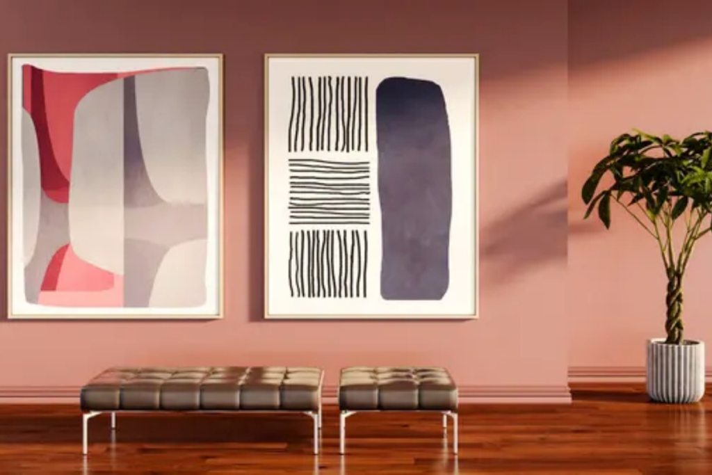
Wall art actually plays a pretty crucial role here.
Because it doesn’t take up space, yet it’s right within your line of sight, making it an easy way to influence the overall atmosphere. You might not call it eye-catching, but if it were missing, the space would feel empty.
Decorative art isn’t just “hung up”—it’s “blended in”
I used to make a pretty common mistake: treating decorative art as a standalone element.
I thought that as long as the painting was beautiful, hanging it up was enough.
But later I realized that if it doesn’t match the entire space, even the most beautiful painting will fail to blend in. It’ll look jarring, and the more you look at it, the more awkward it feels.
Truly good pairing is when you don’t notice the painting at first, but after sitting there a while and glancing at it a few times, you feel that the space is complete.
It’s a bit like the background music in a song—it doesn’t overpower the main melody, but the space just wouldn’t feel right without it.
For example, once I switched to a painting with a grayish tone, and it created a subtle, almost imperceptible harmony with the colors of the sofa and rug.
That’s when I realized that “harmony” is what brings a space to rest.
Some easily overlooked small details

Actually, more often than not, the problem isn’t the painting itself, but rather the details in the margins.
Take the hanging height, for example.
If you hang it too high, it creates a sense of distance; if you hang it too low, it feels like it’s weighing down the space.
Then there’s the relationship between the painting and the furniture.
For instance, if your sofa is quite wide but the painting is much narrower, it will look a bit “squeezed in” and lack a sense of grandeur.
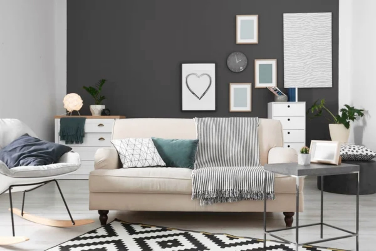
Then there’s the number of paintings.
Some people prefer a single large piece, while others like a group of smaller ones—neither is wrong, but the key is to create a sense of rhythm in the overall composition.
These are things you wouldn’t normally think about, but once you fine-tune them bit by bit, the entire atmosphere of the room changes instantly.
The Gradual Changes in Life
I’m not the type of person who can get my home perfectly organized all at once. I’m more used to taking things slowly—trying out a new painting today, then moving it around a bit later if I feel it’s not quite in the right spot.
For a while, I even developed a rather odd habit—turning off the main lights at night, leaving just a floor lamp on, then curling up on the sofa and staring at the wall. Believe it or not, under that light, the paintings on the wall, the blank spaces, and the shadows all take on a special depth.
Sometimes, as I’d gaze, I’d suddenly notice a small spot that felt just right—I’d even find myself wanting to linger on it a bit longer.
That feeling is hard to replicate; it isn’t something you design, but rather something that emerges on its own. Yet once it appears, you’ll find yourself growing a little more attached to this space—as if it’s no longer just four walls, but a place that gradually grows closer to you.
When it comes to style, there really is no standard answer
Many people ask, “What style should I choose?”
But honestly, there’s no fixed answer to this question.
Some prefer minimalism, some love vibrant colors, some favor landscapes, and others prefer abstract art.
The key isn’t following whatever’s trendy, but whether your mind gradually relaxes when you look at it.
I eventually found my own direction—something a bit minimalist, but not cold or impersonal. It’s that kind of piece with a touch of warmth, where the composition isn’t overly complex, yet it doesn’t strain the eyes. Art like this lets me stay in the room for hours without feeling restless, and I never get tired of it after just a couple of days.
A Personal Insight on Making Choices
When it comes to actually choosing decorative art, let me tell you—I’ve made my fair share of mistakes.
Some pieces, when you first see them, wow—they’re absolutely stunning. You can’t wait to buy them and bring them home. But after hanging them on the wall for a month or so, they start to feel a bit “noisy,” and your eyes get tired looking at them. On the other hand, some pieces seem plain and unremarkable at first, but over time, the more you look at them, the more comfortable and calming they become.
So now, when I choose art, I place a lot of emphasis on the idea of “lasting appeal.”I really like the different series from Huemaster. They’re all handpainted oil paintings—real artists mixing the colors and applying the brushstrokes. That unique, handcrafted feel is something no print can ever match. They’re my favorite, and honestly the ones I recommend the most. The whole vibe is just really balanced—not the kind of art that screams for attention, but somehow it fits perfectly in any space. And the colors especially have this restrained, understated quality that doesn’t jump out at you. It’s very tasteful. I chose a slightly larger piece for the living room, which pairs perfectly with the sofa to create a visual focal point—substantial yet not stiff. For the dining area, I picked a set of lighter, smaller prints with a more delicate rhythm. With this arrangement, the whole home avoids that “forced design” look, but the moment you glance at it, you’ll notice—ah, the depth and dimension just emerge naturally.
A few final thoughts:
There are no hard-and-fast rules for wall art—it’s all about how it interacts with the space.
Don’t overcrowd the walls, and don’t overdo it; leave some room to tweak things over time. As you go along, you’ll naturally get a feel for how to arrange and choose pieces.
With some things, you’ll just know if they’re right after looking at them for a while.