
Creating an intuitive date picker is crucial for enhancing user experience in mobile applications. Choosing the right mobile date picker not only simplifies date selection but also helps reduce errors and align with users’ expectations. As seamless app interactions become more important, a user-friendly date picker can set your app apart by improving efficiency and accessibility. Developers must focus on usability details to make interfaces functional and inviting for diverse users. Using purpose-fit date pickers streamlines workflows, especially in travel booking, event scheduling, and forms that require accurate date input. Familiar, responsive date selection reduces user frustration and boosts engagement, helping retention. Understanding the different types of date pickers and their best uses is key to making your app stand out.
Beyond usability, digital accessibility standards require date pickers to accommodate users with various abilities. Touch targets should be large enough, interfaces must adapt to devices and orientations, and support for keyboards and alternative navigation makes apps more inclusive. Well-designed date pickers validate inputs, minimize errors, speed tasks with smart defaults, and provide real-time feedback. Empathetic design makes interactions straightforward and secure, increasing adoption and satisfaction.
Understanding Date Picker Types
There are several types of date pickers, each tailored to suit specific user scenarios and interface needs:
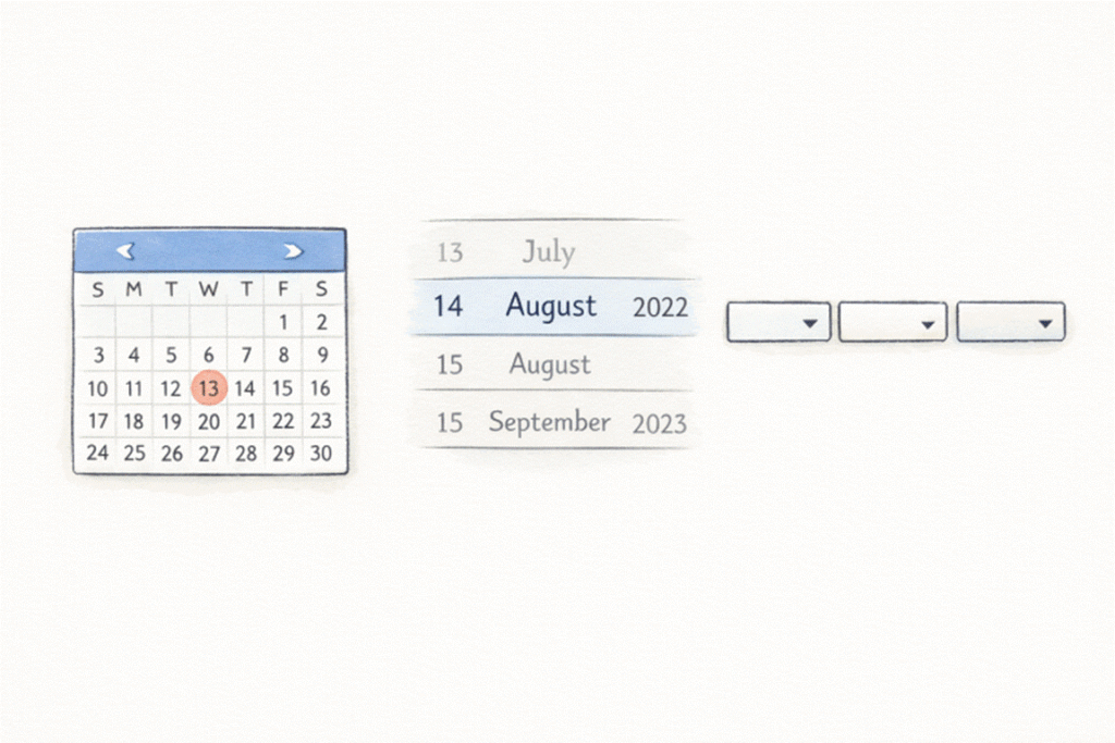
- Calendar View: This type is suitable for selecting specific dates, such as appointment booking or event planning. It provides a familiar calendar interface, allowing users to visualize dates over a month, making it easy to avoid mistakes like selecting an unavailable date.
- Scrolling Date Pickers: Ideal for compact mobile layouts, these use wheels or carousels to select days, months, and years. Their space efficiency and tactile interaction make them a popular choice in mobile apps.
- Dropdown Selectors: These are typically found in desktop applications and web forms. They allow users to choose day, month, or year from dropdown menus, though they can be cumbersome on smaller mobile screens.
Different use cases, such as entering a date of birth versus booking a future event, may require different types of pickers. Selecting the right format based on context is key to ensuring usability.
Designing for Accessibility and Responsiveness
Accessibility and adaptability are central to a successful date picker. Ensure your picker is touch-friendly, with large enough touch targets for users of all abilities. This reduces frustration among users with limited dexterity or those using assistive technologies.
- Touch-Friendly Interactions: All interactive elements, such as buttons or date selection fields, should meet the minimum size guidelines recommended by digital accessibility authorities.
- Responsive Behavior: A date picker should adapt to different screen sizes and resolutions. Whether used on a tablet, phone, or large desktop monitor, the picker’s usability should remain intact.
- Keyboard Input Support: Some users may prefer, or require, manual data entry. Allowing for valid, clearly formatted text input provides flexibility and inclusion for keyboard-dependent users.
Implementing User-Friendly Features
Effective date pickers include features that anticipate mistakes and streamline the process.
- Clear Labels and Instructions: Use contextual labeling and concise instructions to guide the user. For example, “Select your check-in date” is clearer than just “Date.”
- Error Prevention Mechanisms: Disable invalid date ranges (e.g., past dates in booking systems), and provide immediate feedback when users attempt to enter an incorrect format.
- Default Values and Presets: Where appropriate, set logical default dates (today’s date or a common selection window). In calendar bookings, this expedites routine processes and minimizes extra steps for users.
Good design also involves showing contextual hints or helper messages and resetting inputs with a single tap, reducing cognitive load and boosting efficiency. For further insights, review the Material Design documentation on date pickers for recommended features and layouts.
Best Practices for Mobile Date Pickers
Leveraging native UI components in mobile applications is paramount for ensuring consistency and performance. Native pickers, specifically those designed for iOS and Android, are pre-optimized for their respective platforms, offering reliability and familiarity that significantly reduce the user learning curve. To enhance usability, controls should be arranged for comfortable one-handed operation, particularly on larger devices. Additionally, visual feedback is crucial; highlighting the selected date and clearly distinguishing enabled and disabled dates with visual cues helps minimize confusion and guide users intuitively during selection. Adhering to these strategies will lead to a mobile date picker that is both functional and enjoyable, maintaining usability across updates and a variety of user scenarios.
Conclusion
Designing user-friendly date picker interfaces demands a blend of user-centric thought, technical precision, and visual clarity. By selecting the optimal picker type for your context, ensuring accessibility and responsiveness, and embracing best practices, you lay the foundation for a reliable, error-resistant date selection experience. High-quality date pickers not only enhance usability but also contribute to overall app success through improved engagement and satisfaction.