Most cooling complaints sound the same: sticky bedrooms, short cycling, or a unit that runs all day yet never feels right. The psychrometric chart turns those vague symptoms into a measurable story about heat and moisture. Instead of guessing whether the problem is refrigerant charge, airflow, duct leakage, or latent load, you plot what the air is doing before and after key components. That single visual ties together temperature, relative humidity, dew point, enthalpy, and humidity ratio, so your readings no longer live in isolation. When the chart confirms the system is removing the wrong kind of heat, you can diagnose faster, explain findings clearly, and avoid repeat calls.
From measurements to decisions
- Plotting room air and return conditions
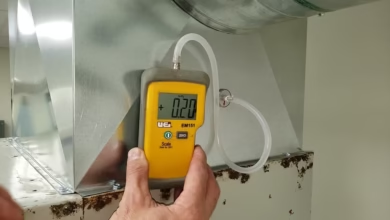
Start with dependable inputs, because a chart only reflects what you feed it. In residential work, that means taking the dry-bulb temperature and either the relative humidity or the wet-bulb temperature at the return, then doing the same at the supply. Use a stable location, away from register throw and outside air influence, and let sensors settle. Once you plot the return point, you can see the home’s moisture burden and comfort status in a way a thermostat never reveals. The supply point shows what the system is delivering, not what it is trying to deliver. The line between them represents the change the equipment created. If the supply is colder but not drier, you may be moving sensible heat while leaving latent load behind, which often feels clammy. If the supply is drier but not much colder, you might be getting latent removal at the cost of capacity, which can show up as longer runtimes and uneven room temps. With two plotted points, you can estimate the sensible heat ratio and track whether the system response matches the complaint.
- Using coil performance to narrow the cause
The most useful moment in psychrometrics is when you connect air-side behavior to what is happening at the evaporator coil. A healthy cooling coil typically drives supply air toward a lower dew point, and the chart will show a drop in humidity ratio along with a drop in dry bulb. If the dry-bulb temperature drops but the humidity ratio hardly changes, it suggests insufficient moisture removal. That can come from high airflow per ton, a dirty coil reducing contact, short runtimes, or a thermostat strategy that ends cycles before dehumidification stabilizes. If the humidity ratio drops strongly while the temperature drop is modest, consider low airflow, low load, or a coil running too cold, which can invite freeze-ups and erratic comfort. This is where field context matters: filter condition, blower tap settings, duct static pressure, and return leakage often explain the plotted pattern better than a quick refrigerant adjustment. When homeowners ask why a reading matters, you can point to the chart and show that the unit is changing air properties in a specific direction, not simply making the air cold. When scheduling air conditioning service in Sandy, UT technicians often use these plots to justify whether the next step is airflow correction, drainage inspection, or deeper refrigeration testing.
- Separating house problems from equipment problems
Psychrometrics also helps you avoid blaming the outdoor unit for an indoor moisture source. If return air plots at a high humidity ratio even when the temperature is reasonable, the home may be importing moisture faster than the system can remove it. Common pathways include duct leaks pulling from humid crawlspaces, return plenums in garages, unbalanced ventilation, or negative pressure drawing in outdoor air. A quick before-and-after comparison during a door-opening event or bath-fan operation can reveal how sensitive the house is to infiltration. The chart makes that sensitivity visible because the humidity ratio shifts quickly when moisture is introduced, even if the temperature barely changes. You can then test the assumptions: temporarily seal the return leak, remeasure, and see whether the return point moves. If it does, your fix is on the building side. If it does not, your focus returns to coil behavior, airflow, and runtime. This is especially powerful in shoulder seasons when outdoor temperatures are mild, but humidity is high, because homeowners feel uncomfortable while the unit cycles normally. A plotted return condition that sits near the saturation curve is a clear indicator that dehumidification, ventilation control, or source removal must be part of the solution.
- Turning plotted data into corrective actions
Once you have the pattern, match it to the adjustments that actually change psychrometric outcomes. If the chart shows weak latent removal, improve coil contact time and moisture separation before touching refrigerant. Verify total airflow and static pressure, check the blower wheel, clean the coil, confirm proper condensate drainage, and confirm the fan setting does not run continuously after a cooling call. If the chart shows supply air is extremely dry and cold with signs of instability, confirm the system is not starving for airflow, and look for restrictions that could pull coil temperature down. In either case, use repeated plots to validate changes. Take readings after corrections and compare the new line between return and supply points to the old one. That delta is your proof. It also keeps you honest, because a fix that sounds right but does not move the plotted points is not a fix. Over time, you can build a small library of chart patterns associated with common failures such as return leaks, oversized equipment, short cycling, low airflow, and drainage issues. Those patterns speed up diagnosis on the next call and improve communication with homeowners who want clear reasons, not guesses.
Closing the loop with measurable comfort
The psychrometric chart is not a classroom artifact; it is a practical way to translate comfort into numbers you can verify. When you plot return and supply conditions, you see whether the system is reducing temperature, removing moisture, or doing a bit of both, and you can connect that to what occupants feel in real rooms. That clarity reduces unnecessary part swaps and prevents the cycle of adjusting the charge to mask airflow or building issues. It also helps set expectations: some homes need moisture-source control, duct sealing, or thermostat adjustments to stay comfortable, even with a properly functioning condenser and coil. Treat every adjustment as a testable hypothesis, then replot to confirm the outcome. When the line on the chart moves in the right direction, and the rooms feel steadier, you have a durable fix that holds up under inspection and seasonal changes.